 More and more people are using their mobile devices to access the Internet. “In 2013, mobile users spent 63% more time on their devices accessing mobile websites and apps and this is set to increase,” states the Social Media Examiner. It’s often frustrating to try to visit a site on a phone, only to have the site not be user friendly with mobile devices. Different issues, such as a mobile website taking too long to upload, too much scrolling, or a font being too small to see on a phone screen, may affect people’s desire to visit your site. Some features, such as clicking like or sharing via social media may not be available on your mobile device unless you have customized it through a WordPress plugin. Many people don’t know that creating a mobile website for their site or blog will make it easier for individuals accessing that site from their mobile device to interact with it. And the good news is that creating a mobile website will not alter your original blog in any way.
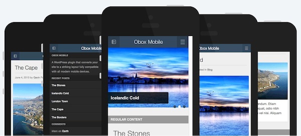
Obox Mobile is a great WordPress plugin for making a blog mobile-friendly. The first version of this plugin came out in 2010, and allowed blog owners to convert their WordPress sites to mobile format. Obox works with any mobile system: Apple, Windows, Android or Blackberry. It retails for $79 for a single pack, which will allow you to work with five websites, or $139 for the developer option, which gives you access to work with unlimited mobile websites.
In March 2014, Obox Mobile 3.0 came out with new and improved features, which are:
* Complete Redesign: “The plugin has undergone a complete design overhaul, both the theme, the admin options panel and the features have been upgraded and improved. We’ve updated the layout to make it more usable with a sleek widgetized side-bar, improved slider and a massive amount of visual customization,” says Obox.
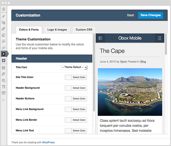
Obox Visual Customizer
*Visual Customizer: The new version of this WordPress plugin features a Visual Customizer which allows you to set up how you want your mobile website to look by changing different aspects of the design.
*Widgetized Homepage: The new Obox Mobile also features a Widgetized Homepage, which allows users to modify the content on their homepage by choosing different layouts, columns and categories.
*Popout Sidebar: A new Popout Sidebar “is the first WordPress mobile plugin with a sidebar for all your favorite widgets as well as search, categories, latest posts and more,” says Obox.
Obox also lists some other updates that came with version 3.0:
- Advert manager
Sell advertising space on your mobile site with the built-in Obox Advert Manager. - Author blocks
Display all the details of your post authors, perfect for blogger networks. - Automatic image resizing
Obox uses the safe and secure WordPress image resizer to do away with manual resizing, saving time and ensuring better results. - Control comments
Elect whether to display or hide comments in posts, pages or both. - Control menus
Enjoy ultimate control of how your menu items show up on your website. - Control thumbnails
Choose whether to display or hide post images in post lists, pages or both. - Display post meta
Decide what ‘meta’ items you’d like to display such as author name, categories, date of post and post tags. - Documentation
Easy-to-understand and in-depth, our plugin docs are constantly kept updated to help you with your theme. - Embed functionality
Enabling your theme to automatically create video thumbnails and display statistics like views and plays. - Feature slider
All our themes offer a slick homepage feature slider to showcase your latest work, posts or products. - Flexible homepage
Use the simple drag-and-drop widget system to control your homepage layout, giving you endless design possibilities - Footer text
Add your own footer copyright text. - Force excerpts
Select whether to automatically display a summary of your post on the home and list pages. - Force mobile activation
Switch on this feature to force your site to display in mobile mode regardless of the device your visitor is using. - Logo uploading
Maintain your site’s branding with a logo uploader that allows for multiple logos to be stored for various uses. - Multi language support
Translate themes into your preferred language. - Social linking
Share on Facebook, Twitter or Google+, available in each post. - Site analytics
Track visitors who view your site via their mobile devices by inserting your Google Analytics code through a simple form in the settings panel. - Threaded commenting
All themes come with built-in threaded commenting, meaning better conversations for your visitors. - Visual customizer
Determine the look and feel of your mobile site using the built-in visual color customizer. - Widgetized sidebar
Include a pop-out sidebar with all your favourite widgets, including search, categories, latest posts and more. - Works on all smartphones
Obox Mobile works on iPhones, Androids, Nokia smartphones, Blackberry and Opera Mobile-based browsers.
 Obox Mobile 3.0 will also provide you with tracking data, which will allow you to see how many people visit your mobile website during a day, month, quarter or year. This is very useful information so you can compare how many individuals go to your mobile vs. your regular site. Also, it provides additional information, such as how people found your site, through a keyword search, or from a link from another site. This information will help you to target additional visitors, and possibly guide you as to where and how to advertise to increase traffic to your site.
The team at Behla Design is dedicated to creating visual experiences that effectively tell our clients’ stories while engaging, exciting, and enticing their customers. Our firm consists of the top web design and development, WordPress, search engine optimization (SEO), and copy writing professionals. Our founder, Andrew Behla, has worked in the graphic, print and web design industry for over twenty years.
For more information about making your site mobile friendly, contact Behla Design.
"*" indicates required fields